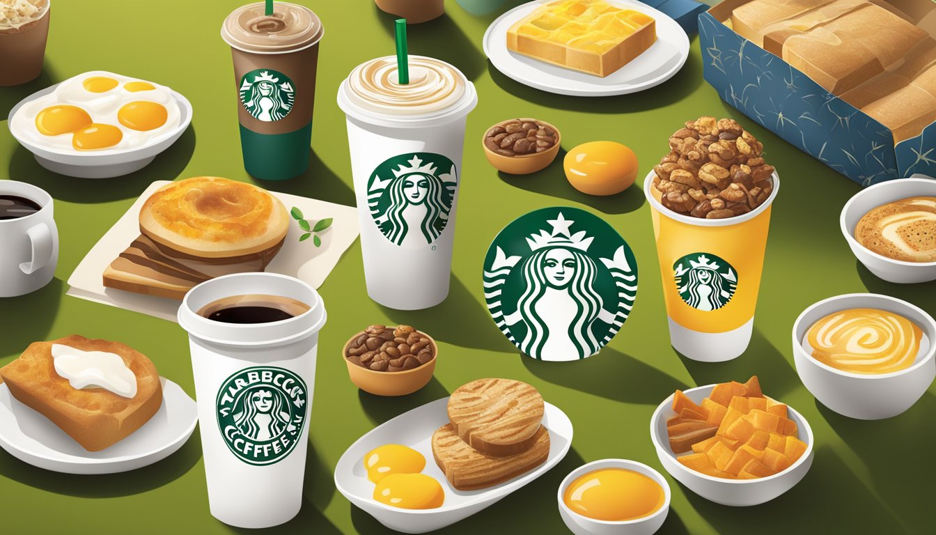
Starbucks has masterfully utilized color psychology in its breakfast packaging to evoke specific emotions and drive consumer behavior. The company’s strategic use of green, white, and earthy tones creates a cohesive brand identity while influencing customer perceptions.
The green hues prominently featured in Starbucks’ breakfast packaging convey freshness, health, and environmental consciousness. This color choice aligns with the brand’s commitment to quality ingredients and sustainable practices. White elements in the packaging design suggest cleanliness and purity, reinforcing the perception of premium products.
Warm, earthy tones incorporated into Starbucks’ breakfast packaging evoke feelings of comfort and approachability. These colors subconsciously invite customers to relax and enjoy their morning meal, fostering a positive association with the brand. By carefully selecting and combining these colors, Starbucks has created packaging that not only stands out on shelves but also resonates with consumers on an emotional level.
The Significance of Color in Branding

Color choices in branding play a crucial role in shaping consumer perceptions and influencing purchasing decisions. Strategic use of color helps companies like Starbucks create strong brand identities and forge emotional connections with customers.
Fundamentals of Color Psychology
Color psychology examines how different hues affect human emotions and behaviors. Red often evokes excitement and urgency, while blue conveys trust and reliability. Green is associated with nature, health, and tranquility.
These color-emotion links stem from evolutionary and cultural factors. For instance, red’s association with danger likely originates from blood and fire.
Marketers leverage these innate responses to colors when developing brand visuals. By selecting colors aligned with their brand values, companies can subtly communicate key messages to consumers.
Brand Identity and Starbucks’ Image
Starbucks’ iconic green logo and packaging exemplify effective use of color in brand identity. The company’s signature green evokes feelings of relaxation, freshness, and eco-friendliness.
This color choice aligns perfectly with Starbucks’ brand positioning as a welcoming “third place” between work and home. The soothing green hues invite customers to unwind and enjoy their coffee experience.
Starbucks consistently applies this green across its visual touchpoints, from store interiors to product packaging. This color consistency strengthens brand recognition and reinforces the company’s desired associations.
Influence of Color on Consumer Behavior
Colors can significantly impact consumer perceptions and actions. Studies show that up to 90% of snap judgments about products are based on color alone.
The right color choices can:
- Increase brand recognition by up to 80%
- Influence purchase intent
- Affect perceived wait times
- Shape product expectations
For example, yellow and red are often used in fast food branding to stimulate appetite and create a sense of urgency. In contrast, luxury brands frequently use black, gold, and purple to convey sophistication and exclusivity.
Starbucks’ green branding likely contributes to customers’ willingness to pay premium prices for coffee, as the color subconsciously reinforces perceptions of quality and ethical sourcing.
Analyzing Starbucks’ Packaging Colors
Starbucks utilizes a strategic color palette in its packaging to evoke specific emotions and perceptions. The brand’s color choices reflect its values and create a consistent visual identity across products.
The Role of Green and White
Green dominates Starbucks’ packaging, representing nature, growth, and renewal. This color choice aligns with the brand’s emphasis on freshness and sustainability. Green also symbolizes balance and harmony, qualities Starbucks aims to embody in its products and practices.
White plays a crucial supporting role, providing contrast and conveying cleanliness and purity. The combination of green and white creates a visually appealing and easily recognizable package design. This color duo reinforces Starbucks’ commitment to quality and simplicity in its offerings.
Utilization of Accent Colors
Starbucks incorporates accent colors to differentiate product lines and create visual interest. Gold accents often appear on premium products, suggesting luxury and exclusivity. Purple may be used for seasonal or limited-edition items, evoking a sense of creativity and uniqueness.
Red occasionally features in holiday packaging, tapping into feelings of warmth and excitement. These carefully chosen accent colors complement the primary green and white palette while serving specific marketing purposes. By varying accent colors, Starbucks maintains brand consistency while allowing for product differentiation.
Psychology Behind the Starbucks Logo
The Starbucks logo, featured prominently on packaging, carries significant psychological weight. The circular shape conveys unity and completeness. The green color reinforces the brand’s connection to nature and growth.
The stylized siren at the logo’s center draws on mythology and mystery, creating intrigue. Her welcoming pose suggests hospitality and invites customers to engage with the brand. The logo’s simplicity allows for quick recognition, building trust through familiarity.
As packaging evolves, the logo remains a constant, anchoring the brand’s visual identity. Its presence on every package serves as a seal of quality and authenticity for Starbucks products.
Emotional Responses to Starbucks’ Packaging

Starbucks’ packaging design taps into psychological triggers to elicit specific emotional responses from customers. The carefully chosen colors and imagery aim to create positive associations and foster brand loyalty.
Evoking the Right Emotions
Starbucks’ breakfast packaging incorporates warm, earthy tones to evoke feelings of comfort and home. The use of green in their logo and packaging elements creates a sense of freshness and health. This color choice aligns with the brand’s emphasis on natural, high-quality ingredients.
Brown tones in Starbucks’ packaging can trigger feelings of reliability and dependability. These emotions contribute to building trust between the brand and its customers. The combination of green and brown also connects to the coffee experience, reminding customers of fresh beans and rich brews.
White space in the packaging design conveys cleanliness and simplicity. This can lead to emotions of calm and contentment, important for morning routines.
Cultural Associations with Starbucks Colors
The Starbucks color palette has strong cultural associations that influence emotional responses. In many Western cultures, green symbolizes growth, harmony, and environmental consciousness. This aligns with Starbucks’ commitment to sustainability, potentially evoking positive emotions in environmentally-aware customers.
The iconic Starbucks green has become synonymous with coffee culture for many. This familiarity can trigger feelings of belonging and comfort. For frequent customers, simply seeing the Starbucks color scheme may elicit happiness and anticipation.
In some Eastern cultures, green represents vitality and new beginnings. This association can create positive emotional responses, particularly for breakfast items that start the day.
Impact on Marketing and Sales

Color psychology plays a crucial role in Starbucks’ breakfast packaging, influencing customer perceptions and purchasing behavior. The strategic use of colors in packaging design can significantly affect brand recognition and sales performance.
Color’s Effect on Buying Decisions
Colors in food packaging can stimulate appetite and trigger emotional responses that impact buying decisions. Starbucks’ breakfast packaging often incorporates warm, inviting hues like green and brown, which are associated with nature, freshness, and comfort.
These colors can create positive associations with the brand and its products, potentially increasing the likelihood of purchase. Green, for example, may evoke feelings of health and vitality, aligning with consumers’ desires for nutritious breakfast options.
Research suggests that color can influence up to 85% of consumer purchasing decisions. By carefully selecting colors that resonate with their target audience, Starbucks can enhance brand perception and drive sales of their breakfast items.
Packaging Design and Customer Attraction
The visual appeal of Starbucks’ breakfast packaging plays a significant role in attracting customers and differentiating products on shelves. Well-designed packaging can catch the eye, communicate product benefits, and create an emotional connection with consumers.
Starbucks’ use of consistent color schemes across their breakfast packaging helps reinforce brand recognition. This visual consistency allows customers to quickly identify Starbucks products, potentially leading to increased impulse purchases.
The company’s packaging design also incorporates elements that highlight product freshness and quality. Clear windows or appetizing food imagery can stimulate appetite and entice customers to buy.
By combining attractive colors with effective packaging design, Starbucks can enhance the overall marketing strategy for their breakfast offerings. This approach can lead to improved sales performance and strengthen the brand’s position in the competitive breakfast market.
Starbucks’ Approach to Health and Sustainability

Starbucks has implemented strategies to promote health-conscious offerings and reduce environmental impact through packaging. These efforts aim to appeal to consumers’ wellness priorities while advancing eco-friendly business practices.
Conveying Health Consciousness
Starbucks uses packaging design to highlight nutritional benefits of breakfast items. Calorie counts and key ingredients are prominently displayed on wrappers and containers.
Whole grain options are emphasized through earthy color schemes and natural imagery. Low-fat and plant-based choices feature lighter hues and minimalist designs.
Portion-controlled sizes help guide sensible eating. Single-serve oatmeal cups and protein boxes provide convenient, balanced meals.
Allergen information is clearly labeled to support dietary needs. Gluten-free and dairy-free options use distinct packaging for easy identification.
Eco-Friendly Packaging Initiatives
Starbucks is shifting toward more sustainable materials for food packaging. Recyclable and compostable options are increasingly utilized.
Plant-based plastics derived from corn or sugarcane are replacing traditional petroleum-based materials. These alternatives reduce carbon footprint and fossil fuel dependency.
Reusable container programs incentivize customers to bring their own cups and food containers. Discounts are offered to encourage participation.
Packaging is designed to minimize excess material. Streamlined shapes and sizes reduce waste while maintaining product integrity.
Recycled content is incorporated into paper-based packaging when possible. This helps close the loop on material use and supports circular economy principles.
Design Considerations and Development
Starbucks’ breakfast packaging design involves careful planning and strategic choices. Color plays a crucial role in creating visual appeal and reinforcing brand identity.
Research Methods for Package Design
Starbucks employs various research techniques to inform their packaging design decisions. Focus groups provide valuable consumer insights on color preferences and emotional responses. Eye-tracking studies reveal which package elements draw the most attention.
Surveys and market analysis help identify color trends and cultural associations. Starbucks also conducts competitive analyses to ensure their packaging stands out on store shelves.
A/B testing allows designers to compare different color schemes and layouts. This data-driven approach helps optimize packaging for maximum visual impact and consumer appeal.
Creating a Cohesive Visual Identity
Starbucks maintains a consistent visual identity across its breakfast packaging line. The iconic green logo serves as a focal point, anchoring the design and reinforcing brand recognition.
Color palettes are carefully selected to complement the logo and evoke specific emotions. Warm browns and rich creams convey comfort and quality for coffee-based products. Vibrant fruit hues signal freshness in healthier breakfast options.
Typography and graphic elements are harmonized to create a unified look. Clean lines and simple shapes ensure readability and modern aesthetics. Product photography is styled consistently to showcase appetizing textures and ingredients.
Packaging materials are chosen to align with Starbucks’ sustainability goals while maintaining product integrity. This holistic approach results in visually appealing, brand-consistent breakfast packaging.
Cultural and Demographic Factors
Starbucks tailors its breakfast packaging colors to resonate with diverse cultural preferences and demographic groups. The company’s strategic use of color reflects its understanding of target audiences and global branding challenges.
Target Audience and Color Selection
Starbucks carefully selects packaging colors to appeal to its core demographic of urban professionals aged 25-40. Warm earth tones like deep greens and rich browns evoke feelings of comfort and sustainability, aligning with this group’s values. Brighter accent colors attract younger customers, while muted tones appeal to older patrons.
Cultural backgrounds influence color perceptions. In Western markets, Starbucks uses green to symbolize freshness and nature. Asian markets see more red packaging, as the color represents good fortune.
Global Branding and Local Preferences
Starbucks maintains consistent brand colors globally but adapts packaging to local tastes. In Japan, seasonal pink cherry blossom themed items boost sales. Middle Eastern locations feature more gold accents to convey luxury.
The company conducts extensive market research to understand regional color associations. This approach helps Starbucks balance global recognition with local relevance. By respecting cultural norms, Starbucks builds brand loyalty across diverse markets.
In China, Starbucks introduced jade-colored packaging for tea products, acknowledging the cultural significance of the color. This strategy helped the brand connect with Chinese consumers and differentiate its offerings in a competitive market.
Conclusion

Starbucks’ breakfast packaging colors skillfully blend psychology and branding to create an appealing customer experience. The company’s thoughtful design choices reflect consumer preferences and market trends.
Future Trends in Breakfast Packaging
Starbucks is likely to embrace eco-friendly materials in future breakfast packaging designs. Biodegradable and compostable options may replace traditional plastics and paper.
Color choices could shift towards earthy tones, reinforcing the brand’s commitment to sustainability. Muted greens and browns may feature prominently, appealing to environmentally-conscious consumers.
Smart packaging incorporating QR codes or augmented reality elements may emerge. These innovations could allow customers to access nutritional information or promotional content directly from their breakfast items.
Personalization may play a larger role in Starbucks’ packaging strategy. The company might offer customizable color options or patterns for loyalty program members, enhancing brand engagement.
Seasonal color variations could become more pronounced, with packaging designs adapting to holidays and local cultural events. This approach would keep the brand fresh and relevant throughout the year.


