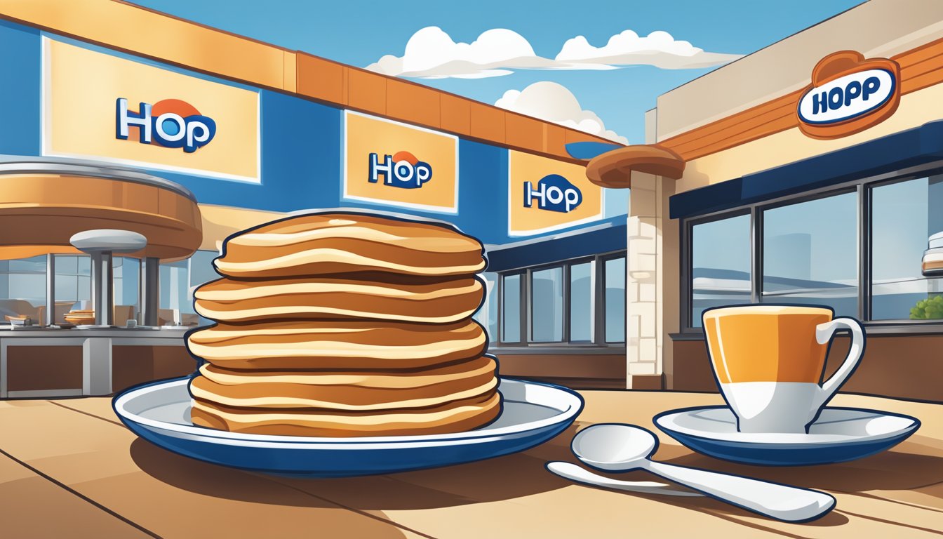
The iconic IHOP logo has undergone several transformations since the restaurant chain’s founding in 1958. From its origins as the International House of Pancakes to the modern abbreviated IHOP, the logo has reflected changing design trends and brand positioning over the decades.
The IHOP logo’s evolution mirrors the company’s growth from a roadside pancake house to a beloved national restaurant chain. Early versions incorporated the full “International House of Pancakes” name, while later iterations embraced the simpler IHOP acronym. The logo’s colors, typography, and graphical elements have shifted to keep pace with contemporary aesthetics and consumer preferences.
In 2015, IHOP unveiled a redesigned logo aimed at evoking positive emotions associated with dining at the restaurant. This updated version cleverly uses the letters ‘O’ and ‘P’ to create a smiling face, visually representing the brand’s “Come Hungry, Leave Happy” slogan. The smile symbolizes the joy and satisfaction customers experience when eating at IHOP, reinforcing the chain’s commitment to delivering a pleasant dining experience.
The Origin and Significance of IHOP
IHOP emerged as an iconic American restaurant chain in 1958, quickly becoming synonymous with pancakes and breakfast fare. Its logo and brand identity have played a crucial role in establishing its presence in the competitive food service industry.
Founding Principles and Brand Identity
IHOP, short for International House of Pancakes, was founded by Al and Jerry Lapin in Toluca Lake, Los Angeles. The brothers aimed to create a restaurant that specialized in pancakes and breakfast items served throughout the day. This concept was novel at the time and helped IHOP carve out a unique niche in the market.
The restaurant’s initial focus on pancakes shaped its brand identity. IHOP’s menu expanded over time, but pancakes remained its signature offering. This specialization was reflected in the company’s name and early marketing efforts.
IHOP’s rapid expansion in the 1960s and 1970s cemented its status as a national chain. Franchising played a key role in this growth, allowing the brand to spread across the United States.
Symbolism in the Original Logo
IHOP’s original logo featured a distinctive design that embodied the restaurant’s core identity. The logo incorporated a stylized house shape, representing the “House” in International House of Pancakes. This visual element reinforced the brand’s focus on providing a homey, welcoming atmosphere for diners.
The logo’s color scheme typically included blue and white, colors associated with cleanliness and trust. These hues helped establish IHOP as a family-friendly dining destination.
Text in the original logo prominently displayed “International House of Pancakes,” emphasizing the restaurant’s specialty. This clear communication of the brand’s offering helped attract customers seeking breakfast foods.
The logo’s design remained largely consistent for several decades, contributing to brand recognition and customer loyalty. Its longevity demonstrates the effectiveness of the original concept in capturing IHOP’s essence.
Evolution of Typography and Style
The IHOP logo’s typography and style have undergone significant changes since the company’s founding in 1958. These transformations reflect broader design trends and the brand’s evolving identity.
Early Design Choices
IHOP’s initial logos featured bold, uppercase lettering. The original 1958 design used a thick, sans-serif font for “INTERNATIONAL HOUSE OF PANCAKES.” This choice emphasized clarity and readability, crucial for a new restaurant chain.
In the 1970s, IHOP adopted a more playful approach. The logo incorporated a stylized coffee cup and a curved baseline, adding visual interest. The typography remained bold but took on a slightly rounded appearance, softening the overall look.
Transition to Modern Typography
The 1990s saw IHOP embrace its abbreviated name in the logo. This shift allowed for a more compact, versatile design. The new typography featured a custom typeface with rounded edges and subtle serifs.
In 2015, IHOP unveiled a major redesign. The updated logo retained the familiar blue and red color scheme but introduced a completely new typographic style. The letters became more rounded and friendly, with the ‘O’ and ‘P’ cleverly forming a smiley face.
This latest iteration balances modernity with approachability, using clean lines and a cheerful design to evoke positive emotions associated with the IHOP dining experience.
Culinary Iconography in the IHOP Logo
The IHOP logo cleverly incorporates pancake imagery to represent the restaurant’s signature dish. This visual symbolism reinforces IHOP’s brand identity as a pancake-focused eatery.
Integration of Pancake Imagery
IHOP’s logo design subtly references pancakes through its use of circular shapes. The “O” in IHOP resembles a round pancake, while the curved line beneath it evokes a smile. This clever visual play serves a dual purpose – it represents both the restaurant’s culinary focus and the positive dining experience.
The logo’s blue and red color scheme further enhances its pancake association. The blue background could be seen as reminiscent of blueberry pancakes, while the red accent adds a pop of color similar to strawberry or cherry toppings.
In recent iterations, the IHOP symbol has become more stylized. The 2015 redesign emphasized the smiling face formed by the “O” and “P” letters, creating a cheerful image that aligns with the brand’s “Come Hungry, Leave Happy” slogan.
Pivotal Changes and Rebranding Efforts

IHOP has undergone significant transformations in its visual identity and marketing strategies over the years. These changes aimed to modernize the brand’s image and appeal to new customer segments.
The Role of Advertising Campaigns
IHOP’s advertising campaigns have played a crucial role in shaping public perception of the brand. In 2020, the company unveiled a refreshed logo for the first time in two decades. This update aimed to address concerns that the previous design resembled a frown.
The new logo featured a smile-like curve, emphasizing IHOP’s commitment to creating positive dining experiences. This visual shift aligned with broader marketing efforts to position IHOP as a cheerful, welcoming establishment.
Television commercials and social media campaigns highlighted the updated logo, reinforcing IHOP’s brand values of warmth and hospitality. These efforts helped maintain brand relevance in a competitive restaurant landscape.
Temporary IHOb Rebranding Impact
In June 2018, IHOP executed a bold marketing stunt by temporarily rebranding as “IHOb” – International House of Burgers. This move generated significant buzz and media attention.
The campaign aimed to promote IHOP’s expanded burger menu and shift perceptions beyond breakfast offerings. Social media platforms exploded with discussions about the name change, increasing brand visibility.
While the rebrand was short-lived, it successfully drew attention to IHOP’s lunch and dinner options. The temporary “IHOb” logo featured a flipped “p” to create a “b,” maintaining visual continuity with the original design.
This campaign demonstrated IHOP’s willingness to take risks and adapt its branding to changing market demands. It also showcased the power of temporary rebranding in capturing public interest and driving conversation.
Comparison to Similar Logos

IHOP’s logo stands out among restaurant chains through its distinctive use of typography and color. The evolution of IHOP’s visual identity offers insights when compared to competitors in the casual dining space.
Analysis of Competitors’ Visual Identity
Denny’s utilizes a similar red and white color scheme but opts for a more angular font. Their logo lacks the curved elements seen in IHOP’s design. Waffle House employs a yellow and black palette, creating a stark contrast to IHOP’s softer tones.
Perkins Restaurant & Bakery uses a green leaf motif, emphasizing their farm-fresh ingredients. This differs from IHOP’s focus on typography. Cracker Barrel’s logo features a rustic wooden sign design, appealing to a different aesthetic than IHOP’s modern look.
Benchmarking IHOP’s Brand Image
IHOP’s smiling logo, introduced in 2015, sets it apart from competitors. The clever use of the ‘O’ and ‘P’ to form a face creates a memorable visual hook. This playful element is unique among major breakfast chains.
The brand’s consistent use of blue helps it stand out in a sea of red and yellow fast-food logos. IHOP’s curved elements and rounded font convey a friendlier, more approachable image compared to some competitors’ bolder, more aggressive designs.
IHOP’s logo evolution shows a trend towards simplification, mirroring broader design trends in the restaurant industry. However, IHOP has maintained its distinctive curved elements, preserving brand recognition while modernizing its look.
Cultural Impact and Consumer Perception
IHOP’s logo has become deeply intertwined with American breakfast culture and the restaurant industry. Its distinctive design evokes feelings of comfort and familiarity for many consumers.
Associations with Breakfast and Brunch Culture
The IHOP logo’s blue and red color scheme has become synonymous with classic American breakfast fare. Many associate the smiling “op” in the logo with stacks of fluffy pancakes drizzled in syrup. This visual cue triggers cravings and nostalgia for leisurely weekend brunches.
The logo’s presence on signage and menus reinforces IHOP’s position as a go-to spot for breakfast at any time of day. Its cheerful, welcoming design aligns with the casual, family-friendly atmosphere IHOP cultivates in its restaurants.
Enduring Legacy in the Restaurant Industry
IHOP’s logo has maintained remarkable staying power over decades. Its simplicity and memorability have helped it endure while other restaurant logos underwent frequent redesigns. The logo’s longevity has cemented IHOP as an iconic American dining brand.
Many consumers can instantly recognize the IHOP logo, even when glimpsed briefly. This strong brand recognition gives IHOP an edge in the competitive restaurant landscape. The logo’s classic design also lends IHOP an air of timeless reliability that resonates with loyal customers.


