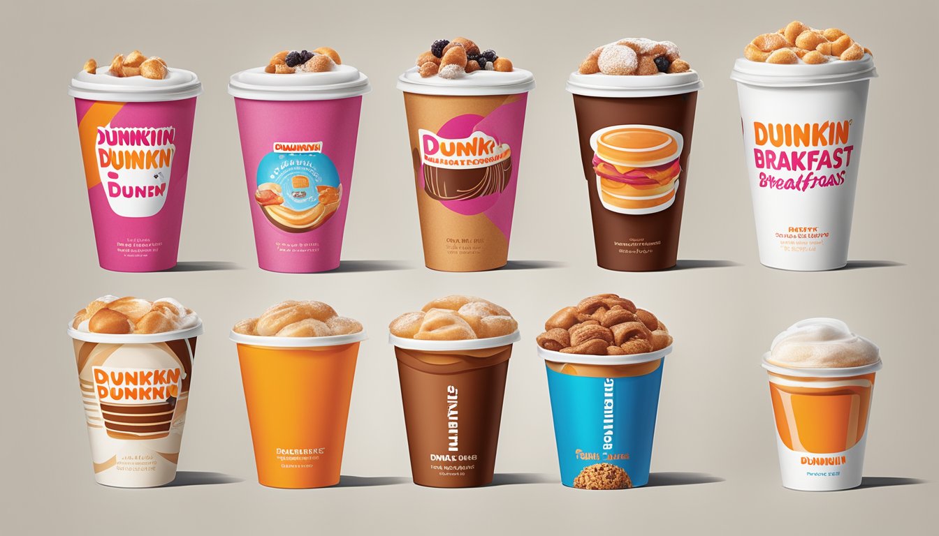
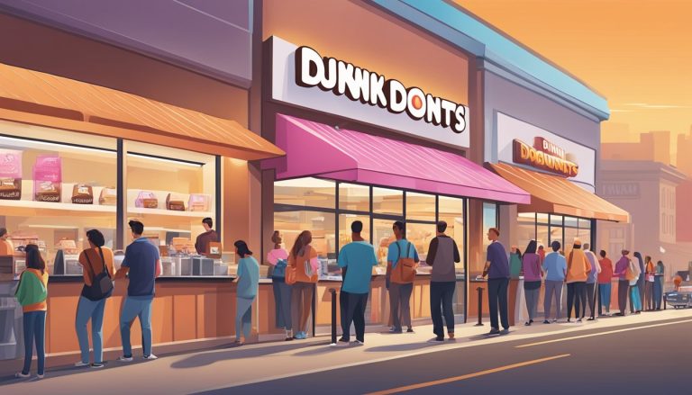
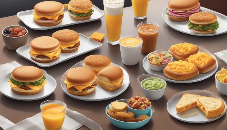
Dunkin’ has undergone a remarkable transformation in recent years, particularly in its approach to breakfast packaging design. The iconic pink and orange color scheme remains, but the brand has streamlined its visual identity to reflect a broader focus beyond just donuts. This evolution in packaging design mirrors Dunkin’s strategic shift towards becoming a beverage-led, on-the-go brand for modern consumers.
The new packaging incorporates an ownable illustration style that communicates bold flavors and the fun personality that defines Dunkin’. This design approach extends across various product lines and seasonal offerings, creating a consistent visual language that strengthens brand recognition. The simplified logo, which now omits the word “Donuts,” represents Dunkin’s expanded menu and its commitment to meeting diverse customer preferences.
Dunkin’s redesigned packaging not only enhances the overall customer experience but also aligns with the brand’s commitment to transparency and quality. The updated designs reflect a careful balance between maintaining familiar brand elements and introducing fresh, contemporary aesthetics. This evolution in packaging design positions Dunkin’ for continued growth and innovation in the competitive breakfast and beverage market.
The Early Years of Dunkin’ Packaging
Dunkin’ Donuts’ packaging design has played a crucial role in establishing its brand identity since the company’s inception. The early years saw the development of iconic visual elements that would become synonymous with the Dunkin’ experience.
Initial Design and Branding
In the 1950s, Dunkin’ Donuts’ packaging focused on functionality and simplicity. The company used plain white paper bags for donuts and basic cups for coffee. These straightforward designs reflected the brand’s no-frills approach to serving quality food and beverages.
As customer loyalty grew, Dunkin’ began incorporating more branded elements. They introduced pink and orange colors, which would become their signature palette. This color scheme helped create a cheerful, energetic atmosphere in stores.
The packaging also started featuring the Dunkin’ Donuts name more prominently. This helped increase brand recognition and differentiate their products from competitors.
Dunkin’ Donuts Logo Evolution
The Dunkin’ Donuts logo has undergone several transformations since its creation. The original logo, designed in the 1950s, featured a stylized coffee cup with the company name.
In 1960, the brand introduced the iconic “DD” logo. This design incorporated a coffee cup and a donut, perfectly encapsulating the company’s core offerings. The simplicity and memorability of this logo made it instantly recognizable.
Throughout the 1970s and 1980s, the logo saw minor tweaks. The company experimented with different fonts and slight alterations to the cup and donut imagery. These changes helped modernize the brand while maintaining its familiar essence.
The logo’s evolution reflected Dunkin’ Donuts’ growing brand identity. It became a symbol of consistency and quality for customers, reinforcing their loyalty to the brand.
Transition to Dunkin’: Rebranding Strategies

Dunkin’ undertook a major rebranding effort to modernize its image and expand its appeal beyond donuts. This shift aimed to position the brand as a beverage-led, on-the-go focused company while maintaining its core identity.
Redefining the Brand
In 2018, Dunkin’ Donuts dropped “Donuts” from its name, becoming simply “Dunkin'”. This change reflected the company’s desire to be known for more than just donuts. The simplified logo retained the familiar pink and orange color scheme but focused on the word “Dunkin'” alone.
The rebranding extended to store designs, merchandise, and menu offerings. New store layouts emphasized speed and convenience, catering to busy customers seeking quick service. Dunkin’ expanded its beverage options, including more coffee variations and cold drinks, to appeal to a broader audience.
This strategic move helped Dunkin’ compete more effectively in the evolving quick-service restaurant market. By highlighting its beverage offerings, the brand aimed to capture a larger share of the lucrative coffee market.
Impact of ‘America Runs on Dunkin” Campaign
The “America Runs on Dunkin'” slogan played a crucial role in the rebranding strategy. Launched in 2006, this campaign became a cornerstone of Dunkin’s brand identity and positioning.
Key aspects of the campaign’s impact:
- Emphasized Dunkin’s role in fueling Americans’ daily lives
- Positioned the brand as an essential part of customers’ routines
- Reinforced the idea of Dunkin’ as a quick, convenient option for busy people
The slogan’s success lay in its ability to connect with customers on an emotional level. It portrayed Dunkin’ as a relatable, everyday brand that understood and supported the fast-paced American lifestyle.
By aligning with this message, Dunkin’ strengthened its brand perception as a go-to destination for coffee and quick meals. The campaign helped shift focus away from donuts, supporting the broader rebranding efforts and new brand positioning.
Packaging Innovation and Menu Expansion

Dunkin’ has continuously evolved its packaging and menu offerings to meet changing consumer preferences and market demands. The company’s innovations have focused on enhancing convenience, quality, and variety across its food and beverage lineup.
Breakfast Sandwiches Packaging
Dunkin’ reimagined its breakfast sandwich packaging to improve portability and freshness. The company introduced insulated wrappers that keep sandwiches warm while preventing sogginess. These wrappers feature easy-tear openings for on-the-go consumption.
Dunkin’ also developed sturdy cardboard boxes for larger breakfast items. These boxes have separate compartments to keep ingredients fresh and prevent mixing. The packaging includes clear labeling of ingredients and nutritional information.
Beverage Innovation and Packaging
Dunkin’ expanded its beverage offerings with new coffee drinks and packaging solutions. The company introduced resealable cold brew bottles for retail sale. These bottles feature sleek designs with the Dunkin’ logo prominently displayed.
For in-store beverages, Dunkin’ developed insulated cups with improved lids to prevent spills. The company also launched reusable tumblers in various sizes and designs to appeal to environmentally conscious customers.
Dunkin’ expanded its latte and espresso menu, using distinctive cup designs to differentiate these premium offerings. The packaging for these drinks often features artistic elements and bright colors to catch the eye.
New Items and Environmental Considerations
Dunkin’ has introduced packaging innovations for new menu items while prioritizing sustainability. The company developed compostable bowls for its protein-rich Power Breakfast Sandwich. These bowls are made from plant-based materials and break down naturally.
For its expanded food menu, Dunkin’ created modular packaging that accommodates various portion sizes. This flexible approach reduces waste and allows for easy customization of orders.
Dunkin’ has also transitioned to recyclable paper bags for to-go orders, eliminating single-use plastic bags. The company continues to explore eco-friendly packaging options to reduce its environmental impact while meeting consumer demands for convenient, high-quality breakfast options.
Preserving Quality and Customer Preferences

Dunkin’ has consistently focused on maintaining product quality while adapting to evolving consumer tastes. This approach has been key to their success in both domestic and international markets.
Material Selection and Design Quality
Dunkin’ prioritizes high-quality materials for their breakfast packaging. They use sturdy paperboard for hot beverage cups, ensuring heat retention and preventing leaks. Their donut boxes feature grease-resistant coatings to maintain product freshness.
The company has also introduced recyclable and compostable options in response to environmental concerns. These include fiber-based lids and straws made from plant-based materials.
Dunkin’ regularly tests new packaging designs to improve functionality. Recent innovations include spill-proof lids and insulated sleeves for hot drinks. These enhancements aim to enhance the customer experience while maintaining food safety standards.
Adapting to Global Consumer Preferences
As Dunkin’ expands globally, they tailor their packaging to suit local tastes. In Asian markets, they offer smaller portion sizes and emphasize tea-based beverages. This strategy reflects regional dietary habits and preferences.
The company also adapts their branding for different cultures. In some countries, they use more vibrant colors and incorporate local design elements on packaging. This helps create a sense of familiarity for international customers.
Dunkin’ conducts extensive market research to understand regional preferences. They gather feedback on package sizes, materials, and designs. This data informs their localization efforts and helps maintain customer satisfaction across diverse markets.
Digital Transformation in Packaging

Dunkin’ has embraced digital innovation to enhance its packaging design and customer experience. The company leverages technology to create interactive, personalized packaging that aligns with modern consumer expectations.
Integration with Digital Marketing
Dunkin’ integrates QR codes and augmented reality features into its breakfast packaging. These digital elements allow customers to access nutritional information, promotions, and branded content by scanning the packaging with their smartphones. The company also uses smart packaging technologies to track inventory and freshness, ensuring quality control.
Strategic partnerships with tech companies enable Dunkin’ to implement near-field communication (NFC) tags in some packaging. These tags facilitate contactless payments and loyalty program interactions, streamlining the purchase process for customers.
Social Media Influence on Packaging
Social media plays a crucial role in shaping Dunkin’s packaging design strategies. The company creates Instagram-worthy packaging designs to encourage user-generated content and increase brand visibility online. Limited-edition packaging tied to social media campaigns generates buzz and drives engagement.
Dunkin’ monitors social media trends to inform packaging updates, ensuring designs resonate with its target audience. The brand also incorporates hashtags and social media handles directly on packaging to prompt customers to share their Dunkin’ experiences online, fostering a sense of community around the brand.
Community and Sustainability Initiatives
Dunkin’ has focused on engaging local communities and enhancing sustainability in its packaging designs. These efforts aim to strengthen customer loyalty while reducing environmental impact.
Community Engagement and Brand Loyalty
Dunkin’ actively participates in community initiatives to foster strong connections with customers. The brand supports local charities and organizes volunteer events, encouraging franchisees to get involved in their neighborhoods.
Dunkin’ hosts “Coffee with a Cop” programs, bringing law enforcement and residents together in a relaxed setting. This builds positive relationships and enhances community trust.
The company’s scholarship programs support education, awarding funds to deserving students. This commitment to local youth resonates with customers and reinforces brand loyalty.
Dunkin’ also sponsors community events and sports teams, increasing visibility and goodwill. These sponsorships create positive associations and strengthen emotional connections with the brand.
Sustainability in Packaging Design
Dunkin’ has made significant strides in sustainable packaging design. In 2018, the company pledged to eliminate foam cups by 2020, replacing them with double-walled paper cups.
This move reduced waste and improved recyclability. The new cups maintain heat retention while using more eco-friendly materials.
Dunkin’ also introduced strawless lids for cold beverages, reducing plastic waste. These lids are made from recyclable polypropylene.
The brand’s napkins now contain 100% recycled content, minimizing environmental impact. Dunkin’ continues to explore innovative packaging solutions that align with consumer preferences for sustainability.
These initiatives demonstrate Dunkin’s commitment to reducing its environmental footprint while meeting customer expectations for responsible business practices.
Design Elements and Their Impact

Dunkin’s visual identity has evolved through strategic use of color, iconography, and packaging design. These elements work together to create a cohesive brand experience across stores and products.
Colors and Brand Identity
Dunkin’s iconic pink and orange color scheme forms the foundation of its visual identity. The vibrant palette evokes energy and warmth, aligning with the brand’s focus on beverages and quick service. In 2018, Dunkin’ simplified its logo by removing “Donuts” while retaining the familiar hues. This change signaled a shift towards a more beverage-centric brand positioning.
The updated color palette extends beyond the logo to packaging, signage, and store interiors. Orange represents the energizing effects of coffee, while pink adds a playful, sweet touch that nods to the brand’s donut heritage. This consistent use of color helps build brand recognition and creates an inviting atmosphere for customers.
Store Design and Packaging Harmony
Dunkin’ has aligned its store design with its packaging to create a seamless brand experience. The company’s retail spaces now feature more modern, streamlined aesthetics that mirror the simplified logo and packaging design. Clean lines, bold colors, and minimalist fixtures create an efficient yet welcoming environment.
Packaging design echoes the in-store experience, with cups, boxes, and bags featuring the updated branding elements. The simplified logo and color scheme are prominently displayed on packaging, reinforcing brand identity with every purchase. This harmony between store design and packaging helps create a consistent brand image across all customer touchpoints.
Dunkin’ has also incorporated digital menu boards and mobile ordering stations in many locations, integrating technology with the physical store design. These updates reflect the brand’s evolution and commitment to meeting changing consumer preferences.
The Competitive Landscape of Coffee Chains

The coffee chain industry is fiercely competitive, with major players vying for market share through innovative packaging and menu offerings. Starbucks and Dunkin’ lead the pack, but face growing competition from boutique cafes and health-focused establishments.
Starbucks vs. Dunkin’: Packaging Wars
Starbucks and Dunkin’ employ distinct packaging strategies to attract and retain customers. Starbucks opts for sleek, premium designs that reinforce its upscale brand image. Their cups feature the iconic green logo and often showcase seasonal artwork. Dunkin’, in contrast, uses bright, cheerful packaging with orange and pink hues to convey a more approachable, everyday vibe.
Both chains have invested in sustainable packaging options to appeal to environmentally conscious consumers. Starbucks introduced reusable cups with discounts for repeat use, while Dunkin’ has moved towards recyclable materials for its cups and lids.
Innovations Beyond Starbucks
While Starbucks remains the industry leader, other chains are making significant strides in packaging innovation. Dunkin’ has rolled out digital ordering systems integrated with their mobile app, allowing for faster pickup and reducing packaging waste. Smaller boutique chains have experimented with biodegradable cups and edible packaging to differentiate themselves.
Consumer preferences are shifting towards more sustainable and convenient options. This has led to the rise of reusable cup programs and partnerships with eco-friendly packaging suppliers across the industry. Franchisees play a crucial role in implementing these innovations, adapting to local market demands while maintaining brand consistency.
Future Projections: Dunkin’s Packaging Horizon

Dunkin’s packaging strategy is poised for significant evolution in the coming years. The company aims to align its designs with emerging consumer preferences while navigating franchise considerations.
Anticipating Customer Trends
Dunkin’ is likely to embrace sustainable packaging solutions to meet growing environmental concerns. Biodegradable cups and recyclable food containers may become standard offerings. The brand could introduce smart packaging with QR codes for nutritional information and promotional content.
Seasonal and limited-edition packaging designs are expected to play a larger role in Dunkin’s marketing efforts. These unique designs will aim to boost customer engagement and drive social media sharing.
Dunkin’ may also explore personalized packaging options, allowing customers to customize cup designs or add their names, enhancing the brand experience.
The Role of Franchising in Packaging Decisions
Franchisees will play a crucial role in implementing new packaging initiatives. Dunkin’ will need to balance franchisor-driven innovations with franchisee input and operational considerations.
The company may establish a franchisee advisory board focused on packaging decisions. This collaborative approach will ensure that new designs are practical for in-store use and align with local market preferences.
Dunkin’ could offer franchisees flexible packaging options to cater to regional tastes and regulations. This strategy would support global expansion efforts while maintaining brand consistency.
Training programs for franchisees on new packaging systems and sustainability practices will be essential for successful implementation across the Dunkin’ network.


