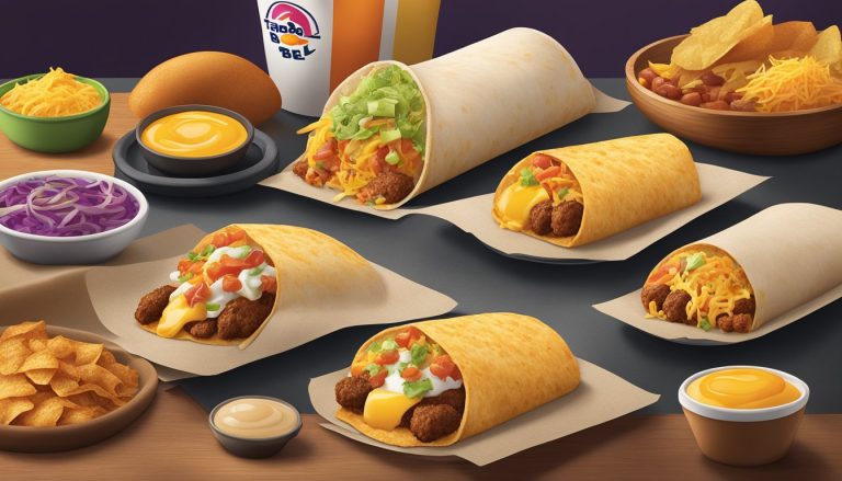
Taco Bell’s breakfast branding and packaging leverage color psychology to create a distinct visual identity and evoke specific emotional responses from consumers. The fast food chain’s strategic use of colors in its breakfast offerings aims to attract attention, convey quality, and influence taste perceptions.
Taco Bell’s breakfast branding incorporates a carefully selected color palette designed to stimulate appetite and create positive associations with their morning menu items. The company’s iconic purple logo provides a unique backdrop for their breakfast campaign, setting them apart from competitors who typically rely on reds and yellows. This color choice helps Taco Bell maintain brand consistency while still differentiating their breakfast offerings.
The packaging for Taco Bell’s breakfast items often features warm, appetizing colors like oranges and yellows, reminiscent of sunrise and early morning light. These hues not only catch the eye but also subconsciously communicate freshness and energy, aligning with the brand’s goal of providing a satisfying start to the day. By understanding and applying color psychology, Taco Bell effectively enhances the appeal of its breakfast products and strengthens its position in the competitive fast food breakfast market.
The Importance of Color in Marketing
Color plays a crucial role in marketing strategies, influencing consumer perceptions and behaviors. It shapes brand identity, evokes emotions, and impacts purchasing decisions across various industries.
Color Psychology Fundamentals
Color psychology examines how different hues affect human emotions and behaviors. Red often signifies excitement and urgency, while blue conveys trust and stability. Yellow can represent optimism, and green is associated with nature and growth. Purple typically symbolizes luxury and creativity.
Research shows that 84.7% of consumers cite color as the primary reason for buying a product. This highlights the significant impact of color choices in marketing materials and product packaging. Marketers leverage these psychological associations to create desired impressions and guide consumer actions.
Key color associations:
- Red: Passion, energy
- Blue: Calm, reliability
- Yellow: Cheerfulness, warmth
- Green: Health, tranquility
- Purple: Royalty, sophistication
Brand Identity and Color
Color is a fundamental element of brand identity, helping companies establish recognition and differentiate themselves from competitors. Consistent use of specific colors across marketing channels reinforces brand image and values.
Studies indicate that color increases brand recognition by 80%. This underscores the importance of selecting and consistently applying brand colors. Companies like Taco Bell use distinctive color schemes to create a memorable visual identity that resonates with their target audience.
Effective color choices align with brand personality and industry norms. For example, many fast-food chains use red and yellow to stimulate appetite and create a sense of urgency, while eco-friendly brands often incorporate green to emphasize sustainability.
Recognizing Target Audience Preferences
Understanding target audience color preferences is essential for effective marketing. Cultural backgrounds, age groups, and gender can influence color interpretations and preferences. Marketers must consider these factors when developing color strategies for specific demographics.
For instance, younger audiences may respond positively to bold, vibrant colors, while older demographics might prefer more subdued tones. Cultural differences can also impact color perceptions – white symbolizes purity in Western cultures but represents mourning in some Eastern cultures.
Market research and A/B testing help identify optimal color schemes for different audience segments. By tailoring color choices to target preferences, brands can improve engagement and conversion rates across various marketing channels and touchpoints.
Taco Bell’s Breakfast Palette

Taco Bell’s breakfast color palette combines appetite-stimulating hues with brand recognition to create an inviting morning menu aesthetic. The carefully selected colors aim to entice customers and differentiate the breakfast offerings from competitors.
Choosing the Right Colors
Taco Bell’s breakfast palette incorporates warm, energizing tones. Red, orange, and yellow dominate the color scheme, creating a visual representation of sunrise and morning vibrancy. These colors are known to increase heart rate and stimulate appetite, making them ideal for breakfast marketing.
Red evokes excitement and urgency, encouraging customers to start their day with Taco Bell. Orange represents enthusiasm and adventure, aligning with the brand’s innovative breakfast options. Yellow symbolizes optimism and happiness, setting a positive tone for the morning meal.
The palette also includes neutral tones like white and beige to balance the bold colors and enhance readability on packaging and menus.
Color Scheme and Cultural Context
Taco Bell’s breakfast color palette draws inspiration from Mexican culture while maintaining brand consistency. The use of vibrant reds and oranges reflects the lively, festive atmosphere associated with Mexican cuisine.
These warm hues also evoke memories of traditional breakfast foods like salsa, peppers, and eggs. By incorporating these colors, Taco Bell creates a visual connection between their breakfast offerings and familiar morning flavors.
The color scheme helps position Taco Bell’s breakfast as a unique alternative to conventional options. It communicates a blend of Mexican-inspired flavors with American breakfast staples, appealing to customers seeking variety in their morning routine.
Color and Consumer Appetite
The breakfast palette is strategically designed to stimulate appetite and create a sense of urgency. Red and orange are known to increase hunger and encourage quick decision-making, prompting customers to make impulse purchases.
Yellow, often associated with happiness and energy, can boost mood and increase the perceived value of food items. This color helps create a positive association with Taco Bell’s breakfast menu.
The combination of these warm colors can also evoke feelings of comfort and satisfaction, important factors for breakfast consumers. By using this palette consistently across packaging, advertisements, and in-store displays, Taco Bell reinforces the appeal of their breakfast offerings and encourages repeat visits.
Brand Identity and Logos

Taco Bell’s brand identity and logos have undergone significant evolution over the years. The company’s visual elements play a crucial role in shaping consumer perceptions and fostering emotional connections through strategic use of color, typography, and design.
Evolution of Taco Bell’s Branding
Taco Bell’s branding has transformed dramatically since its inception. The original logo featured a simple bell design with “Taco Bell” text. Over time, it evolved to incorporate bolder colors and more dynamic elements.
In 2016, Taco Bell unveiled a modernized logo. This redesign maintained the iconic bell shape but simplified it, creating a more versatile and recognizable symbol. The new logo embraced a vibrant color palette, reflecting the brand’s youthful and energetic image.
The latest iteration aligns with Taco Bell’s “Live Más” slogan, emphasizing innovation and cultural relevance. This evolution demonstrates the brand’s ability to adapt to changing consumer preferences while maintaining its core identity.
Typography and Legibility in Logos
Typography plays a vital role in Taco Bell’s logo design. The brand has consistently used bold, sans-serif fonts to convey a modern and approachable image. This choice enhances legibility across various media platforms.
The current logo features a custom typeface that balances readability with distinctive character. Its clean lines and slight curves complement the bell icon, creating a harmonious visual identity.
Taco Bell ensures its logo remains legible at different sizes and in various applications. This attention to detail is crucial for maintaining brand recognition on packaging, signage, and digital platforms.
Emotional Connections Through Color
Color plays a significant role in Taco Bell’s brand identity, evoking specific emotions and associations. The brand’s primary colors – purple and pink – are unconventional choices in the fast-food industry.
Purple conveys creativity, uniqueness, and quality. It sets Taco Bell apart from competitors who often use red and yellow. Pink adds a playful and youthful touch, appealing to younger demographics.
These color choices create a distinctive visual identity that resonates with consumers. They evoke feelings of excitement and novelty, aligning with Taco Bell’s innovative menu offerings and marketing campaigns.
The brand’s strategic use of color extends to its packaging and restaurant design, creating a cohesive and memorable brand experience for customers.
Packaging Design and Color Selection
Taco Bell’s breakfast packaging design and color choices play a crucial role in attracting customers and establishing brand recognition. The company strategically leverages visual elements to create an appealing and memorable product presentation.
Influence of Packaging on Buying Behavior
Packaging design significantly impacts consumer purchasing decisions at Taco Bell. The breakfast menu items are presented in eye-catching containers that showcase the food while maintaining its freshness. Bright, bold colors on wrappers and boxes draw attention and create a sense of excitement.
The use of transparent windows in some packaging allows customers to see the product, increasing appetite appeal. This visual access can trigger impulse buys and reinforce the perception of freshness.
Taco Bell’s breakfast packaging often features appetizing food imagery, further enticing customers. The combination of visuals and colors works to stimulate hunger and encourage sales.
Creating Consistent Visual Identity
Taco Bell maintains a cohesive visual identity across its breakfast packaging. The iconic purple and pink color scheme is prominently featured, instantly connecting products to the brand.
The company’s logo is strategically placed on all packaging, reinforcing brand recognition. Consistent typography and graphic elements create a unified look across different breakfast items.
This visual consistency helps customers quickly identify Taco Bell products in busy food court environments. It also builds brand loyalty by creating a familiar and trustworthy appearance.
Bold Colors and Modern Packaging Trends
Taco Bell embraces modern packaging trends in its breakfast line. The brand utilizes vibrant, contrasting colors to stand out in a competitive fast-food landscape.
Metallic accents and gradient effects add a premium feel to certain breakfast items. These design choices reflect current packaging trends while maintaining Taco Bell’s youthful image.
The company also incorporates eco-friendly materials in some of its breakfast packaging, appealing to environmentally conscious consumers. This approach aligns with growing consumer demand for sustainable practices in the food industry.
Marketing Strategies and Color
Color plays a crucial role in Taco Bell’s breakfast marketing strategies. The brand leverages specific hues to create emotional connections, drive customer engagement, and boost brand recognition across various marketing channels.
Segmentation and Personalized Marketing
Taco Bell uses color to target different customer segments. For breakfast items, warm tones like orange and yellow evoke energy and appetite stimulation. The brand tailors its color schemes to appeal to morning customers seeking quick, satisfying meals.
Digital marketing campaigns utilize color-coded promotions. Mobile apps and social media posts feature vibrant breakfast-themed colors to catch users’ attention during early hours. Personalized offers often incorporate the recipient’s preferred color palette based on past interactions.
Taco Bell’s loyalty program employs color psychology to encourage repeat visits. Members receive specially designed, colorful rewards that stand out in their digital wallets or email inboxes.
Collaborations and Co-Branding
Taco Bell’s collaborations with other brands often involve careful color coordination. When partnering with beverage companies for breakfast promotions, the combined color schemes create visual harmony and reinforce brand associations.
Co-branded packaging for limited-time breakfast offers incorporates colors from both brands. This strategy enhances product visibility and creates a sense of exclusivity. Examples include:
- Purple (Taco Bell) + Green (Mountain Dew) for energy-focused breakfast items
- Purple + Red (Sriracha) for spicy morning menu collaborations
These color combinations help differentiate special offers from regular menu items and drive customer interest.
Advertising and Brand Recognition
Taco Bell’s advertising campaigns for breakfast items heavily rely on color to boost brand recognition. TV commercials and digital ads use the brand’s signature purple alongside breakfast-themed colors to create a distinct visual identity.
Billboard advertisements feature large, colorful images of breakfast items against contrasting backgrounds. This approach ensures high visibility and quick brand association for commuters.
In-store promotions utilize carefully chosen color combinations to guide customers toward breakfast options. Menu boards, posters, and digital displays employ eye-catching hues to highlight new or featured morning items.
Social media content creators use Taco Bell’s color guidelines to maintain brand consistency across platforms. This approach helps reinforce brand recognition and creates a cohesive visual experience for followers.
Color and Brand Loyalty
Color choices play a crucial role in fostering brand loyalty and shaping consumer perceptions. Strategic use of color can create emotional connections and reinforce brand identity.
Fostering Loyalty through Color Choices
Color psychology influences how consumers perceive and interact with brands. Consistent use of specific colors helps create brand recognition and fosters loyalty. For example, Taco Bell’s signature purple conveys creativity and luxury, setting it apart in the fast food industry.
Colors can evoke emotions and memories, strengthening the bond between consumers and brands. Warm colors like red and orange may stimulate appetite, while cool blues and greens can promote feelings of trust and reliability.
Brands often use color to target specific demographics. Vibrant, bold colors may appeal to younger audiences, while more subdued tones can attract older consumers.
Case Studies: Starbucks and Fanta
Starbucks’ iconic green logo has become synonymous with coffee culture worldwide. The green color represents growth, harmony, and environmental responsibility, aligning with the brand’s values and appealing to eco-conscious consumers.
Fanta, known for its bright orange packaging, uses color to convey fun and excitement. The vibrant hue stands out on store shelves and appeals to its target audience of young, energetic consumers.
Both brands demonstrate how consistent color use across marketing materials, packaging, and store designs can build strong brand recognition and loyalty.
Rebranding and Color Transitions
Rebranding often involves color transitions, which can be risky but potentially rewarding. Careful consideration is needed to maintain brand loyalty during these changes.
Gradual color shifts can help ease consumers into a new brand identity. For example, a company might introduce new colors alongside existing ones before fully transitioning.
Some brands opt for bold color changes to signal a significant shift in company direction or values. This approach can attract new customers but risks alienating existing loyal consumers.
Successful color transitions in rebranding often maintain elements of the original palette while introducing fresh colors that align with the brand’s evolving identity and target audience.
Demographic Considerations
Taco Bell’s breakfast branding and packaging colors are strategically chosen to appeal to specific demographic groups. The brand considers generational preferences, cultural perceptions, and gender-based marketing approaches when selecting its color palette.
Generational Color Preferences
Millennials, a key target for Taco Bell’s breakfast offerings, respond positively to bold and vibrant colors. Purple, a signature color for the brand, appeals to this generation’s desire for creativity and uniqueness. Younger consumers often associate brighter hues with energy and excitement, aligning well with Taco Bell’s breakfast menu positioning.
Gen Z, another important demographic, shows a preference for authenticity in branding. Taco Bell incorporates earthy tones alongside its vibrant palette to create a balance that resonates with this group’s appreciation for natural and genuine experiences.
Cultural Factors in Color Perception
Color perception varies significantly across cultures, influencing Taco Bell’s packaging choices for diverse markets. In Western cultures, purple often signifies luxury and creativity, supporting the brand’s innovative breakfast offerings.
Hispanic consumers, a crucial segment for Taco Bell, may associate warm colors like red and orange with traditional breakfast foods. The brand incorporates these hues to create familiar and appetizing visuals for this demographic.
Asian markets might interpret certain colors differently. For instance, white, often used in Western food packaging, can symbolize mourning in some Asian cultures. Taco Bell adapts its color schemes accordingly to ensure cultural sensitivity.
Gendered Color Marketing
While Taco Bell aims for broad appeal, subtle color choices can influence gender-based perceptions of its breakfast items. Traditionally, marketing has associated softer pastels with feminine products and bolder, darker tones with masculine ones.
Taco Bell navigates this by using a mix of colors that avoid strong gender stereotypes. Purple, their signature color, is often seen as gender-neutral and appeals to a wide audience.
For products targeting female consumers, the brand might incorporate softer shades or warmer tones. Male-oriented items may feature cooler colors or darker variations of the brand’s palette.
Psychological Effects of Specific Colors

Colors play a crucial role in shaping consumer perceptions and behaviors. Different hues can evoke distinct emotional and psychological responses, influencing appetite, comfort levels, and brand positioning.
Red and Stimulation of Appetite
Red is a powerful color in food marketing, known for its ability to stimulate appetite. It triggers physiological responses, increasing heart rate and blood pressure. This heightened state can lead to increased hunger sensations.
Taco Bell strategically uses red in its breakfast branding to create a sense of urgency and excitement. The color draws attention to menu items and packaging, making food appear more appealing and enticing.
Red also conveys warmth and energy, aligning with the breakfast theme of starting the day strong. Its bold presence helps Taco Bell’s morning offerings stand out in a competitive market.
Blue and the Perception of Comfort
Blue, while less common in food branding, can create a sense of comfort and trust. Taco Bell incorporates blue tones in its breakfast packaging to balance the stimulating effects of red.
This color choice helps establish a calming atmosphere, important for early morning customers. Blue can reduce stress and lower heart rate, creating a more relaxed dining experience.
In combination with red, blue helps Taco Bell strike a balance between excitement and comfort in its breakfast branding. This color pairing aims to attract customers while ensuring they feel at ease.
Green, Black, and Niche Branding
Green in food packaging often signifies freshness and health. Taco Bell may use green accents to highlight the quality and freshness of breakfast ingredients.
This color choice can appeal to health-conscious consumers, suggesting nutritious options among the breakfast menu items. Green also connects with nature, potentially evoking feelings of vitality and renewal.
Black, used sparingly, adds sophistication to Taco Bell’s breakfast branding. It can create contrast and draw attention to specific elements of packaging or menu designs.
For niche items or limited-time offers, black may be employed to convey exclusivity or premium quality. This strategic use of color helps Taco Bell differentiate certain breakfast products within its lineup.
Conclusion
Taco Bell’s breakfast branding and packaging leverage color psychology to create a powerful impact on consumers. The strategic use of vibrant purples, oranges, and yellows evokes feelings of energy and excitement, aligning with the brand’s youthful image.
These color choices influence consumer perceptions and behaviors. Purple conveys creativity and uniqueness, setting Taco Bell apart in the competitive fast-food breakfast market. Orange stimulates appetite and enthusiasm, while yellow adds a sense of cheerfulness to the morning meal experience.
Taco Bell’s color strategy extends beyond aesthetics. It reinforces brand recognition and creates a cohesive visual identity across all touchpoints. This consistency helps build trust and familiarity with customers, potentially leading to increased brand loyalty and sales.
The company’s approach demonstrates a deep understanding of consumer psychology. By tapping into the emotional responses triggered by specific colors, Taco Bell crafts a memorable breakfast experience that resonates with its target audience.
This color-focused branding strategy showcases how thoughtful design choices can significantly impact marketing effectiveness. It highlights the importance of considering psychological factors in creating successful brand identities and packaging designs in the fast-food industry.


